
Eight Animal Icon Sets Every Designer Should Have on Hand
A curated lineup of beach, garden, pet and Easter animal icons in editable SVG, ready for web, print and seasonal campaigns.
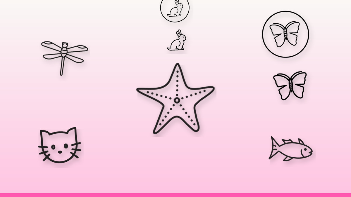
Animal imagery does heavy lifting in design work that has nothing to do with zoology: a fish sells a seafood menu, a cat sells a pet app, a bunny sells a spring promotion. The trouble is sourcing icons that actually match in weight and style once you need more than one. A single mismatched icon in a row of otherwise-clean marks is enough to make a layout look unfinished.
We built this set to solve that specific problem — sea life, garden insects and household pets that share consistent line weight and proportions, so they drop into the same navigation bar, product grid or printed flyer without extra cleanup. Every icon is editable SVG, so recoloring for a brand palette or resizing for a favicon takes seconds, not a redraw.
The vectors

A beach silhouette that scales from favicon to hero banner
The five-point shape stays legible even at 16–24px, which makes it a safe pick for site navigation, app icons or seafood and travel badges where space is tight. Because the outline is so simple, it recolors cleanly to coral, ocean blue or sandy neutrals without losing shape. Use it solo as a spot icon, or repeat it as a light background pattern behind a summer sale banner.
Get this vector →
A garden and pond motif for nature and eco-minded brands
The wing detail needs a bit more room than a solid silhouette, so keep it at 32px or larger anywhere it appears small, and reserve tiny placements for favicons only. It reads well as a single-color line icon in a row of nature marks — think garden centers, pond maintenance services, or eco-product packaging — and pairs naturally with the butterfly icon for a coordinated insect set.
Get this vector →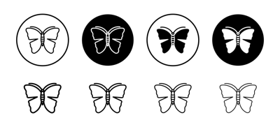
A spring and garden icon that also works as a repeat pattern
This winged shape is instantly recognizable even simplified, making it ideal for spring email headers, kids' products, beauty packaging or nature blogs. Its symmetry makes it one of the easiest icons in this set to tile as a subtle repeating background at low opacity behind text. Keep it above 20px if any inner wing detail needs to stay visible on screen.
Get this vector →
A pet-care icon built for small UI spaces
The compact, front-facing pose holds up at app-icon and favicon sizes, which is exactly where pet apps, vet clinics and grooming brands need a mark to still read clearly. Use it as a single-color icon in navigation or account menus, and switch to a bolder fill weight if it's appearing at 16px so the features don't blur. It also works as a friendly avatar placeholder in pet-care apps.
Get this vector →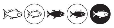
A market-ready silhouette for seafood and aquarium branding
The side-profile shape is built for signage and packaging, where it needs to survive being printed small on a label or blown up on a storefront sign. It suits seafood restaurants, fish markets, aquarium sites and fishing brands equally well, and recolors easily to match a menu's accent color. Anchor it left or right of a headline rather than centering, since the profile reads a specific direction.
Get this vector →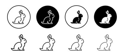
A general-purpose mammal icon for pet and nature content
Unlike the seasonal bunny designs in this set, this rabbit is styled for year-round use — pet care sites, children's brands, nature blogs or general animal-category icon grids. Its upright, simple pose stays clean at small sizes and works well in monochrome for a consistent icon row. Combine it with the cat icon when you need a matched pair of pet-care marks in the same visual weight.
Get this vector →
A festive mark built specifically for spring holiday campaigns
This one is designed for a shorter window of use: Easter email banners, retail spring promotions and children's holiday content, where the added festive detail signals the season instantly. Because it carries more visual weight than the plain rabbit icon, give it a bit more breathing room in layouts — 32px or larger — so the holiday detailing stays crisp rather than muddy at small sizes.
Get this vector →
A storytelling icon for nurseries, greeting cards and kids' content
The burrow scene adds narrative in a single mark, which makes it a strong fit for children's book illustration, nursery decor, greeting cards and playful spring layouts where a plain rabbit silhouette would feel flat. It works best at a larger display size — a hero image or card front — rather than as a small navigation icon, since the hole-and-bunny composition needs room to read clearly.
Get this vector →Getting the most out of an animal icon set
- Keep every icon in a layout at the same stroke weight and detail level so the set reads as one family, not a mismatch.
- Size simple silhouettes like the starfish or fish down to 16px; save winged or detailed marks like the dragonfly for 24px and up.
- Recolor icons to match a two- or three-color brand palette rather than using every default color in the same layout.
- Pair the plain rabbit with the cat icon for evergreen pet content, and save the Easter designs for time-limited spring campaigns.
- Export at the largest size you might need and scale down in design software — SVG holds sharp edges at any resolution.
Browse the full library at infyvector.com.
FAQ
Can I recolor these icons to match my brand's existing palette?
Yes — since each icon is delivered as editable SVG, you can change fill colors directly in your design tool or code editor without redrawing anything. This makes it easy to keep a seafood restaurant's fish icon or a pet app's cat icon consistent with the rest of a brand system.
Are the seasonal designs like the Easter bunny usable outside of Easter?
They're built with holiday-specific detailing, so they read best during spring promotional windows rather than as a year-round mammal icon. For evergreen pet, nursery or nature content, the plain rabbit icon or the bunny-in-hole design are safer choices since they don't signal a specific holiday.
What's the smallest size these icons can be used at without losing detail?
Simple silhouettes such as the starfish and fish hold up down to about 16px, which suits favicons and navigation bars. Icons with finer detail, like the dragonfly's wings or the Easter bunny's added elements, read better starting around 24–32px so the detailing doesn't blur.
Whether you're refreshing a pet-care app, building a spring email campaign, or just need a consistent set of nature icons for a blog, these eight designs are ready to drop in without a redesign detour. Pick the one closest to a project on your desk this week and test it at the actual size it'll ship at.