
Eight Halloween Vectors That Cover Every Post, Deck and Promo This October
A curated set of Halloween icons and characters, from pumpkins to zombies, ready to drop into social posts, slide decks and store promos without redrawing anything.
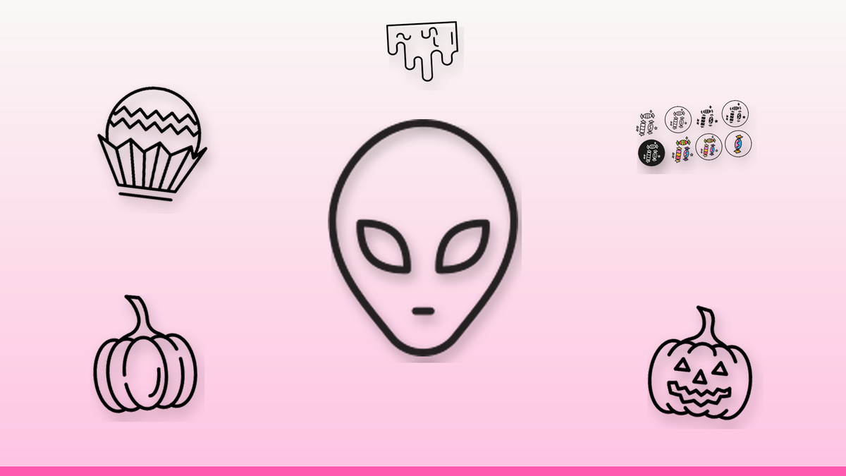
October content calendars fill up fast, and generic clip art makes a brand look like everyone else's Halloween post. A tight set of purpose-built vectors — a jack-o'-lantern, a zombie, a tombstone, a bag of candy — covers the whole season's messaging without forcing a designer to start from scratch for every asset.
We picked eight editable SVGs that work as a system: consistent line weight, simple enough to recolor to any brand palette, and clean at both icon size and hero size. Use them individually as social stickers or combine two or three on a single slide or landing banner for a cohesive seasonal look.
The vectors
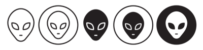
A left-field character for brands that skip the usual monsters
This extraterrestrial face reads as playful rather than gory, so it suits family-friendly promos, sci-fi themed events or tech-brand Halloween posts that want to avoid blood-and-guts imagery. The rounded features stay legible even shrunk to a 32px app icon or profile badge. As an SVG, recolor the skin tone to match your palette and pair it with a simple starfield background for cosplay contests or space-themed party invites.
Get this vector →
The trick-or-treat staple for candy shop and retail promos
A twist-wrapped chocolate reads instantly as a sweet treat, making it the natural pick for candy shop menus, bakery promos or 'treat, not trick' social copy. Its rounded shape and bold wrapper lines hold up at small sizes, so it works equally well as a bullet icon in a product list or blown up on a storefront poster. Keep the wrapper color on-brand and pair with the plain candy icon for variety in a treat assortment graphic.
Get this vector →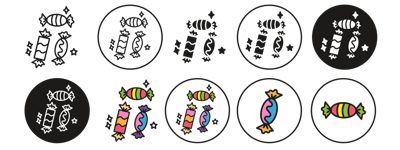
A quick sugar-rush visual for price lists and treat bags
This wrapped lollipop-style candy is simpler than the chocolate icon, making it ideal for dense layouts like treat-bag labels, loyalty punch cards or a row of small bullet icons next to pricing. Its high-contrast silhouette stays readable even in single-color print, so it's a safe choice for flyers as well as screens. Swap the wrapper color to match a seasonal palette of orange, purple or classic candy-corn yellow.
Get this vector →
The default jack-o'-lantern for headers, favicons and countdowns
A classic carved pumpkin face is the fastest way to signal 'Halloween' at a glance, which makes it the go-to for email headers, countdown graphics and calendar reminders. The bold cuts and thick outline hold their shape down to favicon size, and the flat fill recolors cleanly for dark-mode or brand-orange variants. Use it solo as a social avatar overlay, or anchor a banner layout with it on one side and copy on the other.
Get this vector →
A second pumpkin style to avoid repeating the same graphic
This alternate pumpkin gives a different face and proportions from the primary pumpkin icon, so a campaign running multiple posts or a deck with several Halloween slides doesn't repeat the same silhouette twice. Use one style for organic social and the other for paid promos to keep each channel visually distinct while staying on theme. Both scale cleanly from a small ad thumbnail up to a full-bleed event banner.
Get this vector →
An accent graphic for horror-themed headers and dividers
Dripping slime works as a texture accent rather than a standalone subject — run it along the top of a landing page section, under a headline, or as a border on an invite to add a horror-movie feel without extra illustration work. Its drip shapes read clearly in green for classic toxic ooze or in red for a gorier tone. Keep it at low opacity behind text if you need it as a background rather than a focal element.
Get this vector →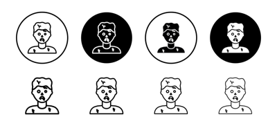
A horror-night mascot for events, gaming and haunted-house promos
This undead face is the strongest 'scary' option in the set, suited to haunted-house ads, horror movie nights, escape-room promos or gaming content that wants an edgier tone than a smiling pumpkin. Its exaggerated features stay readable at social-thumbnail size, and the flat color areas take a green or gray skin tone equally well. Pair it with the tombstone icon for a two-graphic horror scene on a single slide.
Get this vector →
A graveyard marker for RIP jokes, cemetery scenes and closing slides
A simple gravestone shape is useful beyond straight horror content — it works for 'RIP' humor posts about a retired product, a cemetery-themed party layout, or as a closing visual on a Halloween recap deck. Its flat front face is wide enough to hold a short custom label if you edit the SVG, making it doubly useful for personalized invites. Group a few at different sizes for an instant graveyard scene.
Get this vector →Getting the most from a Halloween icon set
- Stick to one or two icon styles per asset — mixing the zombie and both pumpkins on one banner starts to look cluttered.
- Recolor SVGs to your brand's existing palette instead of default orange and black so posts still look on-brand.
- Keep icons at least 24px tall in dense layouts like candy labels; anything smaller loses the carved or wrapper detail.
- Use the slime icon as a background accent, not a focal point, so it doesn't compete with your headline text.
- Test icon colors against your background for contrast, especially dark greens and purples on black social templates.
Browse the full library at infyvector.com.
FAQ
Are these vectors easy to recolor for a brand that doesn't use orange and black?
Yes, since they're editable SVGs the fill colors can be changed in any vector editor to match a brand palette. A pastel or monochrome recolor still reads as Halloween because the shapes themselves (pumpkin, tombstone, zombie face) carry the seasonal meaning.
Will these icons stay sharp on both a business card and a large event banner?
SVG format scales to any size without quality loss, so the same file works as a small favicon and a large-format print banner. Just check line weight at your target size, since very thin details can feel sparse when blown up extremely large.
How do I keep a multi-graphic Halloween post looking cohesive rather than cluttered?
Limit a single layout to two or three icons from the set and keep their line weights and color saturation similar. Using both pumpkin styles together, for instance, works better than combining a detailed zombie with the simpler candy icon in the same tight space.
October content doesn't need a fresh illustration for every post — a handful of well-made vectors, reused with different colors and pairings, can carry a whole campaign. Pick one icon this week, drop it into your next social post or slide, and build the rest of the calendar around it.