
8 Medical Icons Every Health Brand Can Use in Logos, Packaging and Posts
A set of editable medical vector icons, from eye exams to blood donation, ready to recolour and resize for logos, packaging and social posts.
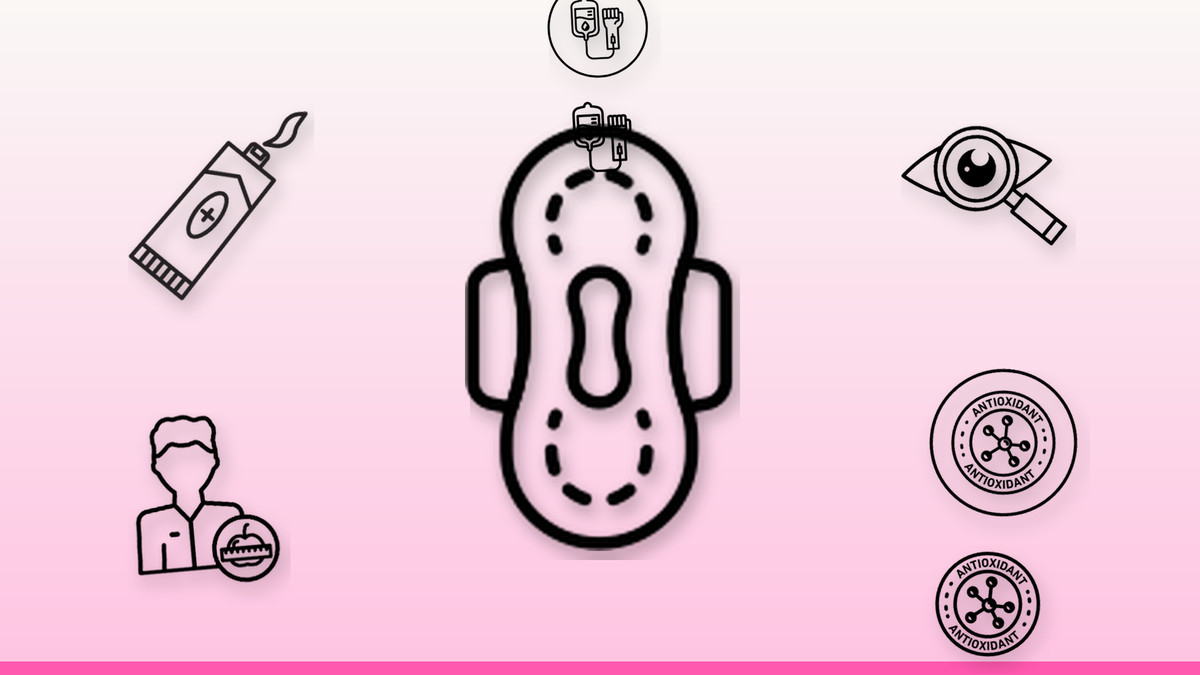
Health and wellness brands live or die on trust, and trust starts with clean, legible visuals. A single icon can signal what a period-care startup, a supplement label or a physical therapy clinic actually does before a customer reads a word. This set covers eight common medical themes in editable vector form, built to scale from a favicon to a box front without losing detail.
Our practical take: pick one icon, recolour it to match your palette, and reuse it everywhere, packaging, app icon, social post, rather than mixing styles across channels. Because every design is editable SVG, you can swap fills, adjust stroke weight and resize freely without blur or jagged edges, so the same file works on a tiny app icon and a large printed poster or storefront sign.
The vectors

A Discreet, Recognisable Mark for Period-Care Products
A simplified pad silhouette reads instantly, even in a single flat colour, which makes it ideal for a period-care brand mark or an app icon where detail gets lost below 32px. Recolour it to a soft pastel for a gentle, approachable feel, or a bold solid for a more clinical, confident look. Use it small and consistent across packaging, checkout icons and social thumbnails so customers recognise the product line at a glance.
Get this vector →
A Clear Symbol for Topical and Pharmacy Products
A tube-and-cream shape communicates topical treatment faster than label copy, which suits pharmacy branding, dermatology clinics or skincare packaging. Keep it monochrome on a product label so it prints cleanly at small sizes, then switch to your brand colour for the matching social post or website icon. Pair it with a short product name underneath rather than crowding the icon with extra text.
Get this vector →
An Instant Signal for Eye-Care Services
An eye-exam icon is the fastest way to say optometry without a headline, useful for an optician's logo, appointment reminder graphic or a clinic's service menu. Because eye shapes rely on fine curves, avoid shrinking it below icon-button size, roughly 24px, or the pupil detail can disappear; for tiny placements, use a simplified silhouette version instead. A single accent colour on the iris keeps it distinctive against a neutral logo.
Get this vector →
A Warm, Ready-to-Use Icon for Nutrition Coaching
This full-colour icon fits a dietitian's service page, a meal-plan social post or a consultation booking flow, since the built-in colour already reads as warm and approachable without extra styling. Keep the original palette for social content where warmth matters, but flatten it to one brand colour if you're placing it next to other single-colour icons in a service menu, so the set stays visually consistent.
Get this vector →
A Quick Visual Cue for Supplement and Wellness Claims
An antioxidant symbol works well on supplement packaging, wellness blog headers or ingredient call-outs where you need to flag a health benefit at a glance. Because the concept is abstract, pair it with a one-word label, antioxidant or wellness, the first time it appears on packaging, then let the icon carry the message alone in follow-up social posts. A muted green or purple tint keeps it aligned with natural-health branding.
Get this vector →
A Respectful Icon for Blood Donation Campaigns
A blood bag and tubing icon is immediately understood as donation or transfusion, making it a strong fit for a blood drive poster, hospital campaign post or blood bank's service icon. Use red sparingly, a full red icon can read as alarming outside a clinical context, so consider a red accent on an otherwise neutral outline for social graphics, and reserve solid red for donation-specific calls to action.
Get this vector →
A Clean Mark for Orthopedic and Physical Therapy Branding
A skeleton or bone icon signals orthopedic care, physical therapy or anatomy content without needing a caption, and its simple linework holds up well even at small sizes like a favicon or app icon. Use it in greyscale or a single brand colour for a clinical, professional tone, and keep surrounding icons in the same stroke weight so a multi-icon service page doesn't look mismatched.
Get this vector →
A Precise Icon for Diagnostic Procedure Content
An endoscope icon is a precise way to represent a diagnostic procedure on a gastroenterology clinic's site, equipment catalog or patient-education post, where plain language can feel too technical. Keep the line weight consistent with any other procedure icons on the same page, and add a text label alongside it the first time it appears, since the device shape is less universally recognised than a stethoscope or heart symbol.
Get this vector →Getting the Most from These Icons
- Keep one icon style per project, line, flat or full colour, so your logo, packaging and social posts feel like one brand.
- Recolour SVGs to match your palette instead of using them as-is; a single accent colour keeps a whole icon set cohesive.
- Test icons at their smallest real size, app icon or favicon, before finalising; simplify further if fine details blur or disappear.
- Pair abstract icons, like antioxidant or wellness marks, with a short text label the first time customers see them.
- Keep stroke width consistent across every icon you place together so a multi-icon page or packaging set doesn't look mismatched.
Browse the full library at infyvector.com.
FAQ
Can I change the colour of these icons to match my brand?
Yes, every icon is a fully editable SVG, so you can recolour fills and strokes in any design tool without losing quality. Stick to one or two brand colours across a set so packaging, app icons and social posts look consistent.
What size can I use these icons at, from a tiny app icon up to packaging?
Because they're vector files, they scale up or down with no loss of sharpness, from a small favicon to a large printed box. For very small placements, choose the simpler, high-contrast icons and test how they look before finalising artwork.
How do I keep a set of these icons looking consistent together?
Match stroke weight and colour style, line, flat, or full colour, across every icon you use on the same page or product. Mixing styles is the fastest way to make a small business's branding look inconsistent, so pick one approach and apply it everywhere.
Start with the one icon closest to your service or product this week: drop it into your logo mark, resize it for packaging, and reuse the same file for your next social post. Consistent colour and sizing across those three touchpoints will do more for brand recognition than a full redesign.