
Eight matching UI icons for hero graphics, feature grids and landing pages
A ready set of eight SVG icons — uninstall, upload/download, DND, gallery, generate, smart home, filter and full-screen — for consistent marketing visuals.
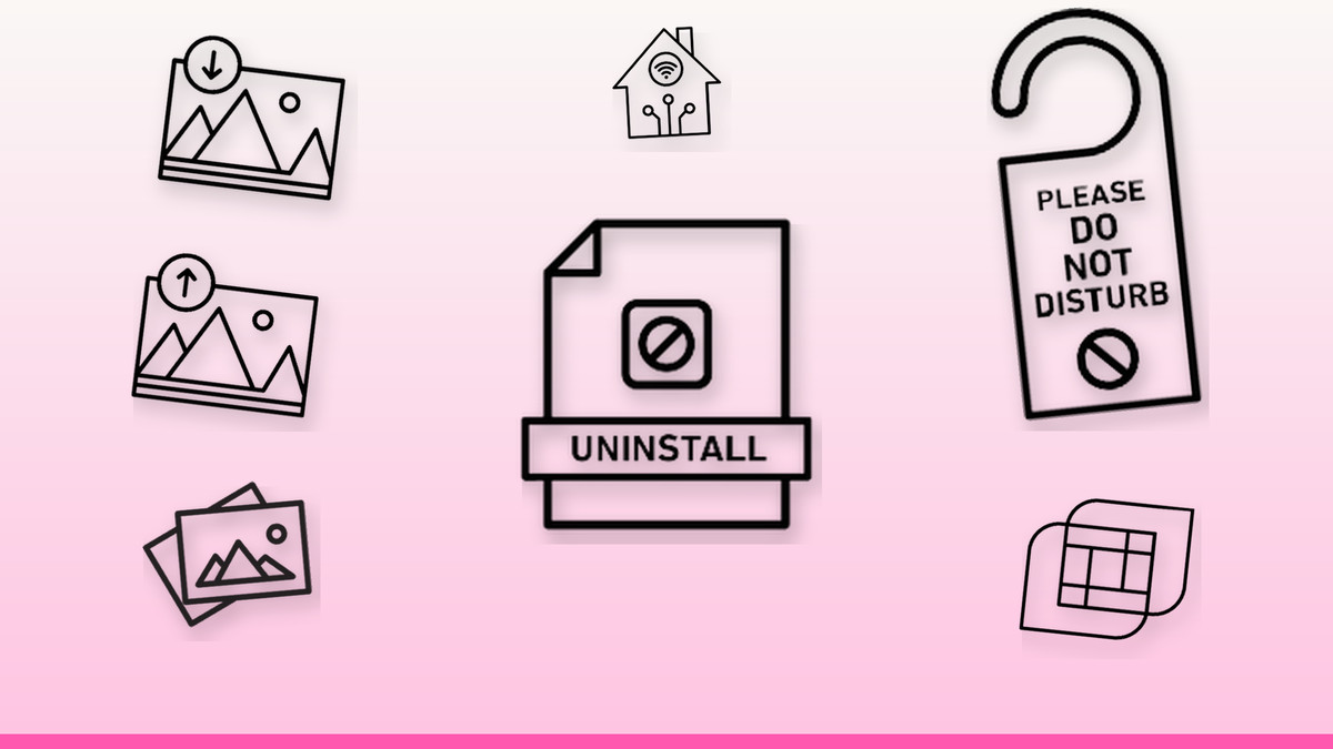
Every ad, slide and landing page section is competing for a half-second glance, and mismatched icon styles are one of the fastest ways to lose that glance — a serif-style glyph next to a rounded one instantly reads as unpolished, even if the copy is sharp. Marketing and design teams are shipping more visual assets per week than ever, across more formats, which makes a single coherent icon system more valuable than any individual clever graphic.
These eight icons cover the interactions that show up constantly in product marketing — uninstalling, transferring images, muting, browsing, generating, automating a home, filtering and expanding a view. Each is a clean, editable SVG built on a shared grid and stroke weight, so you can drop several into one feature grid or hero collage and they'll sit together without adjustment. Recolor them to your palette, resize freely without quality loss, and treat them as a matched set rather than one-off graphics.
The vectors

A clear signal for 'remove app,' not 'delete file'
A trash-adjacent glyph that reads as app removal rather than file deletion — useful when a cleanup or optimization product needs that distinction in a feature grid. The simple silhouette holds up at small sizes, so it survives scaling into an app-store screenshot or a comparison table row. Usage tip: keep it grey or amber rather than red, so it doesn't get mistaken for a destructive delete action during onboarding.
Get this vector →
One icon, two directions: sell photo backup and sharing at once
This icon pairs an image frame with a directional arrow, covering both saving and sending a photo — ideal for cloud-backup apps, photo-sharing tools, or a landing page pitching 'your photos, everywhere.' The arrow is the only variable element, so it's easy to flip for a matched upload/download pair in a feature grid. Usage tip: use the upload arrow in the hero for energy, and the download arrow lower on the page where you describe retrieval or export.
Get this vector →
Signal focus mode without writing a word
A universally understood glyph — crescent moon or minus-in-circle — for showing a quiet-hours or focus state without extra copy. It works well as a status badge beside an avatar in a dashboard mockup, or as a feature-grid icon for messaging apps promoting notification controls. Usage tip: place it at a small fixed size next to UI text in mockups so it reads as a real product status, not a decorative afterthought.
Get this vector →
The nav icon that says 'browse the visuals' at a glance
A grid-of-thumbnails glyph immediately signals a photo library, portfolio, or media browser — exactly what viewers expect next to a 'Gallery' or 'Portfolio' tab in a navigation bar or app screenshot. It pairs naturally with the filter-control icon when mocking up a media app's toolbar, since both belong to the same browsing-and-refining task. Usage tip: use it at 20-24px in navigation bars, and switch to a larger 48px+ version when it's the sole icon on a feature-grid tile.
Get this vector →
The icon every AI or automation CTA needs
A spark or magic-wand motif that's become shorthand for 'AI does this for you' — the natural choice for a primary call-to-action button on a landing page for content generators, report builders, or design tools. Because it's so recognizable, it works even without a label, saving space in a crowded hero section. Usage tip: reserve it for your single most important generative action per screen; using it on multiple buttons dilutes the 'magic moment' signal it's built to carry.
Get this vector →
Pitch the connected-home ecosystem in one glyph
A house-plus-signal icon that communicates 'automated, remotely controlled home' faster than a paragraph of feature copy — well suited to real estate tech, IoT device marketing, or thermostat and security-camera product pages. It reads clearly next to bullet points like 'voice control' or 'remote access' in a feature grid. Usage tip: place it at the top of a three- or four-item feature list as the anchor icon, since 'smart home' is usually the category promise the other icons support.
Get this vector →
Show 'refine your results' without a single word
Stacked sliders are the fastest visual shorthand for filtering and sorting — use this icon next to search bars, product-listing toolbars, or dashboard settings panels in any e-commerce or SaaS mockup. It pairs well with the gallery icon in media-app layouts, and with search fields in marketplace landing pages. Usage tip: keep the slider handles at slightly different heights, as shown, so it doesn't get misread as a simple settings gear at small sizes.
Get this vector →
The expand cue every video demo and deck needs
Four corner arrows pointing outward is the clearest possible cue for 'watch this bigger' — essential on video player mockups, product-demo thumbnails, and any hero image where you want to invite a click-through. In a pitch deck, it doubles as the icon for 'expand to full detail' on a screenshot or chart slide. Usage tip: overlay it at low opacity in a corner of a video thumbnail so it reads as an interactive affordance, not a competing graphic element.
Get this vector →Building a consistent icon set for your next campaign
- Pick icons from one set so stroke weight and grid size match — mismatched icons make a deck look unfinished fast.
- Scale icons in fixed steps (16, 24, 32, 48px) rather than freehand resizing, so alignment stays crisp across slides and breakpoints.
- Recolor SVGs to match a single brand palette instead of mixing icon colors — one accent color per icon keeps a feature grid calm.
- Give every icon breathing room — pad at least 25% of its size on each side so it doesn't collide with headlines or CTAs.
- Add descriptive alt text for each icon used near real interactive elements, so screen reader users don't lose meaning conveyed only visually.
Browse the full library at infyvector.com.
FAQ
Can I recolor these icons to match my brand?
Yes — since they're editable SVG, you can change fill and stroke colors directly in code or in any vector editor without losing quality at any size. Keep one accent color consistent across the set so a feature grid or slide deck reads as a single system rather than assorted clipart.
What size should these icons be in a feature grid versus a hero image?
In a feature grid, 24-32px keeps icons legible next to body copy without overpowering it. In a hero graphic or as a standalone visual, scale up to 64px or larger — since they're vector, there's no blur or pixelation at any size.
Are icon-only buttons like the generate or full-screen icon accessible?
On their own, icons don't convey meaning to screen readers, so pair each with an aria-label or visible text label when it's used as a clickable control. Decorative uses in a deck or ad don't need this, but functional buttons in a live product do.
A consistent icon set does more for a landing page or deck than another stock photo ever will — it signals that the product itself is considered and coherent. Start small: swap one mismatched icon in your current deck or ad for one of these eight, and build outward from there.